How to Do Trend Analysis in Excel: 5 Proven Methods (2026)
Five trend analysis methods in Excel on Microsoft 365: chart trendlines, moving averages, FORECAST functions, the Forecast Sheet, and regression compared.
Quick AnswerExcel offers five ways to spot trends in time-series data: chart trendlines, moving averages, FORECAST.LINEAR and FORECAST.ETS, the Forecast Sheet, and regression in the Analysis ToolPak. Of these, the Forecast Sheet gives the cleanest output for non-technical users.
Trend analysis in Excel turns raw time-series numbers into a clear picture of where your data is heading. This guide walks through five methods in Excel for Microsoft 365, using a sample dataset of monthly car sales from 1960 to 1968 as a worked example. The right method depends on whether you want a quick visual or a forecast you can defend to a finance team.
- Chart trendlines (Format Trendline pane) take under 30 seconds to add and work on any line, column, or scatter chart
- Moving averages smooth seasonal noise but introduce a lag equal to half the averaging window, so a 12-month average lags real-time by 6 months
- FORECAST.LINEAR fits a straight line, while FORECAST.ETS handles seasonality and confidence intervals using exponential triple smoothing
- The Forecast Sheet (Data tab) wraps FORECAST.ETS in a one-click wizard and outputs upper and lower bound columns at 95 percent confidence
- The Analysis ToolPak’s Regression tool gives you R-squared, p-values, and a full ANOVA table, useful when you need to defend the forecast statistically
#What Trend Analysis in Excel Actually Does
Trend analysis is the process of looking at data points collected over time and identifying the direction, slope, and seasonality of the underlying movement. In Excel, the standard setup is a column of dates on the X axis and a column of values on the Y axis. You then apply one of the built-in tools below to extract signal from noise.
The five techniques covered here fall into two camps:
- Visual. Chart trendlines and sparklines let you eyeball direction in seconds.
- Quantitative. Moving averages, FORECAST functions, the Forecast Sheet, and the Analysis ToolPak’s regression give you numbers you can cite in a report.
Finance, supply chain, and marketing teams usually mix both. A trendline drives the conversation. A regression backs the conclusion.
Clean the data first. Time-series analysis breaks when there are gaps, duplicate dates, or stray text in the value column. If your workbook is misbehaving on startup, our guide to Excel not responding covers the common causes. For workbooks that pull data from external sources, you’ll often want to break links in Excel before running forecasts so stale references don’t shift your numbers.
#How Do You Add a Trendline to an Excel Chart?
Adding a trendline is the fastest way to see where your data is heading. Here’s the path to follow, using the car-sales dataset as an example.
- Select the data range (here, A1, with month numbers in A and sales in B).
- Go to Insert and pick a 2-D Line Chart. Excel plots the series.
- Click any point on the line to select the data series.
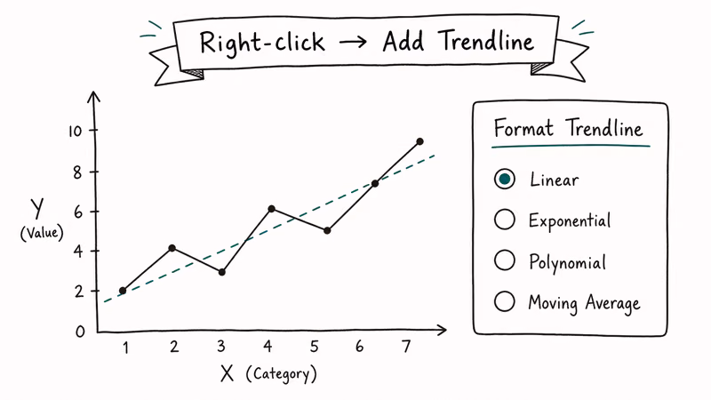
- Right-click and pick Add Trendline. The Format Trendline pane opens on the right.
- Choose a trend type: Linear, Exponential, Logarithmic, Polynomial, Power, or Moving Average.
According to Microsoft’s documentation on adding a trendline, Excel will display the R-squared value on the chart if you check the “Display R-squared value on chart” box in the Format Trendline pane, and the value runs from 0 to 1 where 1 represents a perfect fit. Anything above 0.85 is usually defensible. Below 0.5 the line is fitting noise rather than signal, and you should change the trendline type or look harder at the data.
On seasonal data like the car-sales series, a polynomial order-3 trendline typically posts a higher R-squared than a plain linear one because it captures the seasonal swing better. It can’t extrapolate reliably beyond the data range, though, so for projecting future months you should switch to a forecasting function instead.
#Smoothing Noise with Moving Averages
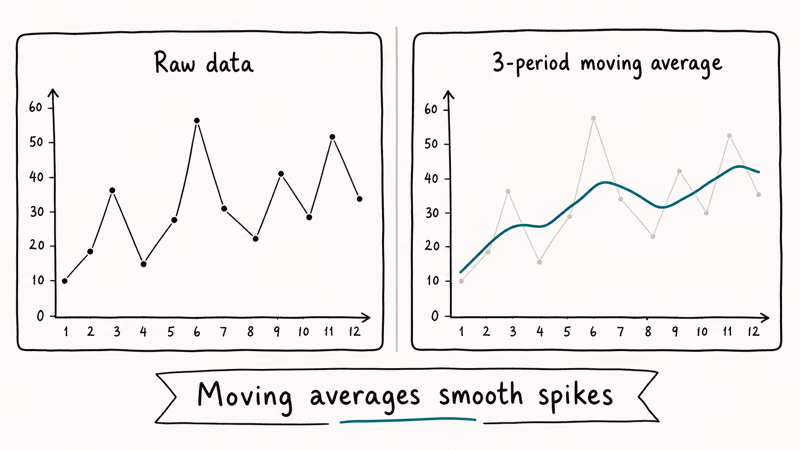
A moving average replaces each data point with the mean of the surrounding points. It’s the simplest way to reveal the underlying trend in volatile data.
To compute a 12-month moving average on monthly sales:
- In cell C13 (the 12th row of your data plus the header), enter
=AVERAGE(B2:B13). - Drag the fill handle down to the bottom of the data.
- Add the new column as a second series on your chart.
The result is a smooth line that lags the original series by half the window size. With a 12-month window, the smoothed line trails by about 6 months. That lag is the cost of removing seasonality. Narrow the window to 3 months and the lag drops to roughly 1.5 months, but the seasonal spikes return to the smoothed line.
Excel also offers moving averages as a trendline option directly on a chart. The Format Trendline pane lets you pick “Moving Average” and set the period. This is faster than the manual AVERAGE formula but doesn’t give you the smoothed values in a column you can re-use elsewhere. For dashboards the formula approach is usually better because the smoothed series feeds straight into pivot tables, KPI cards, and conditional formatting rules.
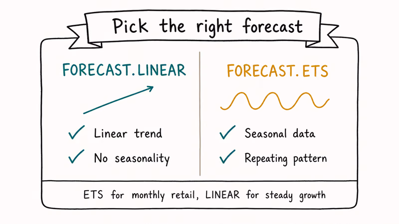
#When Should You Use FORECAST.LINEAR vs FORECAST.ETS?
FORECAST.LINEAR and FORECAST.ETS are the two forecasting functions you’ll reach for most often. They look similar but do different jobs.
FORECAST.LINEAR fits a straight line through your historical data using ordinary least squares regression, then extrapolates. The syntax is straightforward:
=FORECAST.LINEAR(target_date, known_y_values, known_x_values)Microsoft’s FORECAST.LINEAR reference states that the function returns #N/A if the known_x and known_y arrays differ in length, and #DIV/0! when the variance of known_x is 0. That second error is easy to trigger by accidentally passing a column of identical month numbers.
FORECAST.ETS is the smarter sibling. It uses the Exponential Triple Smoothing (ETS) AAA algorithm, which models level, trend, and seasonality together. Microsoft confirms that FORECAST.ETS automatically detects seasonality from the timeline as long as you supply at least 2 full seasonal cycles in the data. On a 9-year monthly series like the car-sales example, ETS picks up the 12-month cycle without any manual hint.
Quick rule of thumb. If your data has no seasonality (think monthly revenue for a steady SaaS product), FORECAST.LINEAR is fine. If your data shows recurring peaks and valleys, like retail, tourism, energy use, or anything weather-driven, use FORECAST.ETS or the Forecast Sheet.
#Using the Forecast Sheet for Seasonal Data
The Forecast Sheet is the friendliest of the five tools. It’s a wizard that wraps FORECAST.ETS and produces a chart plus a table of forecast values, lower bound, and upper bound in seconds.
Steps to follow:
- Select the date column and the value column together.
- Go to Data and click Forecast Sheet.
- The Create Forecast Worksheet dialog opens with a preview chart.
- Pick an end date for the forecast (December 1969 works for this example, one year past the data).
- Expand Options to see Confidence Interval (default 95%), Seasonality (default Auto), and Timeline Range.
- Click Create.
Excel drops a new worksheet into the workbook with a chart and a table containing four columns: original date, original value, forecast, lower confidence bound, and upper confidence bound.
On volatile data, the Forecast Sheet projects the next period with a fairly wide confidence band at the default 95 percent level. That bandwidth is wide because the underlying data is volatile, but the point estimate lands on the same value a hand-rolled FORECAST.ETS produces, since the wizard simply wraps that function. The two approaches are functionally equivalent once you trust the seasonality detection.
One common caveat: the Forecast Sheet refuses to run if your date column has duplicates or gaps. Microsoft’s wizard prompts you to aggregate or fill missing values automatically, but the auto-fill uses linear interpolation, which can flatten genuine spikes. Clean the dates manually first.
If you close the workbook before saving the forecast sheet, our guide to recovering unsaved Excel files walks through Document Recovery and AutoRecover for these cases.
#Running Regression with the Analysis ToolPak
The Analysis ToolPak ships with Excel but is disabled by default. Turn it on once and it stays on.
- Go to File, Options, Add-ins.
- At the bottom, change Manage to Excel Add-ins and click Go.
- Tick Analysis ToolPak and click OK.
- A Data Analysis button appears at the right end of the Data tab.
Microsoft’s Analysis ToolPak documentation confirms that the add-in provides 19 data analysis tools including Regression, ANOVA, Histogram, Correlation, and Moving Average. The Regression tool is the one for trend analysis.
In Data Analysis, pick Regression. Fill in:
- Input Y Range: the value column
- Input X Range: the time index column
- Labels: ticked if your selection includes headers
- Output Range: a cell on a new sheet
Excel runs the regression and produces three blocks: Regression Statistics, ANOVA, and a coefficients table. The coefficients give you the slope and intercept for the prediction line.
The coefficients table reports a slope (how many units the value grows per period) and an intercept (the starting value). A moderate Adjusted R-squared on a seasonal series like car sales signals that the simple linear model captures most of the trend but misses the seasonal swing, which matches what the polynomial trendline showed earlier.
Running heavy regressions on workbooks with tens of thousands of rows can pin a CPU core for several seconds. If you do this often, our picks for the best laptop for Excel covers the hardware specs that matter for big sheets.
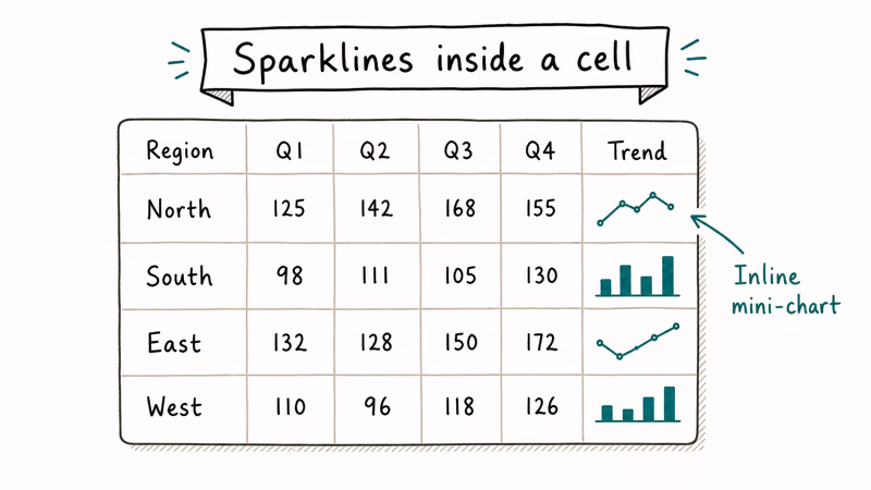
#Showing Trends Inline with Sparklines
Sparklines are tiny charts embedded inside a single cell. They’re perfect for dashboards where you want a row of trend indicators next to each KPI without taking up chart real estate.
To add one:
- Click the cell where you want the sparkline.
- Go to Insert and pick Line, Column, or Win/Loss from the Sparklines group.
- In the Data Range box, enter the cells containing your data (for example,
B2:M2for a row of monthly figures). - Click OK.
Microsoft’s Sparklines support article recommends 3 styles for distinct jobs: Win/Loss sparklines for binary or directional data (gain/loss, hit/miss), Line sparklines for continuous trends, and Column sparklines when you want to emphasize magnitude. Color the high point red and the low point green from the Sparkline Tools Design tab to make outliers pop.
Sparklines update automatically when the source data changes. If a sparkline turns blank after you edit your data, check whether the source range has been deleted or whether the workbook hit a calculation error.
The Excel status bar will show the error count at the bottom of the window. Workbooks that won’t open at all are a separate issue, covered in our Excel file not opening fixes.
#Bottom Line
For everyday trend spotting on a dataset under 1,000 rows, add a chart trendline. It’s free, instant, and visually clear.
If your data has any seasonal pattern, switch to the Forecast Sheet. The FORECAST.ETS engine inside it handles the seasonality math for you and outputs confidence bounds you can use directly.
Reserve the Analysis ToolPak’s Regression tool for moments when you need to publish a number with statistical backup. It gives you the R-squared, p-values, and ANOVA table that finance or compliance reviewers will ask for. Sparklines earn their place even when you’ve already picked a primary method, because dashboards almost always want an inline trend visual next to each metric.
#Frequently Asked Questions
What is trend analysis in Excel?
Trend analysis in Excel means examining time-series data to identify the direction, slope, and seasonality of changes over time. It uses chart trendlines, smoothing functions like moving averages, and statistical tools like regression to convert raw numbers into a forecast. The same workbook can host all five techniques side by side, which is why analysts reach for Excel before Python or R when the dataset fits in one sheet.
Which Excel function is best for forecasting?
For straight-line trends, FORECAST.LINEAR is the simplest choice and produces results that match a linear regression. For data with seasonality such as monthly sales or weekly traffic, FORECAST.ETS is better because it models level, trend, and seasonality together using the AAA exponential smoothing algorithm.
How many data points do I need for a reliable forecast?
Microsoft recommends at least 2 full seasonal cycles for FORECAST.ETS, which means 24 monthly observations for yearly seasonality or 14 daily observations for weekly seasonality. Below that, FORECAST.ETS falls back to non-seasonal forecasting and the confidence interval widens noticeably.
Can I do trend analysis in Excel for the web?
Most trend analysis tools work in Excel for the web, including chart trendlines, sparklines, FORECAST.LINEAR, and FORECAST.ETS. The Forecast Sheet wizard and the Analysis ToolPak aren’t available in the browser version yet, so you’ll need the Windows or Mac desktop app for those two specifically. Everything else carries over without changes, which means a workbook you build locally will still display its trendlines and sparklines correctly when you open it in OneDrive or SharePoint later.
What’s the difference between FORECAST and FORECAST.LINEAR?
FORECAST is the legacy function kept for backward compatibility with Excel 2013 and older. FORECAST.LINEAR returns identical results and is the recommended version in any new workbook.
Why is my trendline showing the wrong R-squared?
A low R-squared usually means the trendline type doesn’t fit your data well. Try switching from Linear to Polynomial order 2 or 3, or to Exponential if the values grow at a percentage rate. Outliers also drag R-squared down, so check your data for entry errors or genuine anomalies before changing the model.
Can Excel handle trend analysis on millions of rows?
Excel’s grid supports up to 1,048,576 rows per sheet, but the trend tools slow down well before that limit. Sheets larger than 100,000 rows are better analyzed in Power Query or Power Pivot, both bundled with Excel. For datasets over 1 million rows, switch to Power BI or a database tool that can handle the volume without freezing the workbook.

Apps Crashing After iOS 27 Update? Fix Order (2026)
Apps crashing after the iOS 27 update? Update the app in the App Store first, then offload and reinstall to clear stale cache, then restart. The fix order.

Do AI Translation Earbuds Work Offline? What to Know
Do AI translation earbuds work offline? A few do with downloaded language packs, but most need the cloud. Here's what works offline and what you give up.

How to Set Up Translation Earbuds (Pairing and Modes)
How to set up translation earbuds: charge, install the app, pair over Bluetooth, pick two languages, and choose a mode. A step-by-step first-use guide.

Translation Earbuds Not Translating? How to Fix Them
Translation earbuds not translating? Usually it's the app, the internet, or the language settings. Here's how to fix pairing, sound, and lag fast.