Power BI vs. Tableau vs. QlikView: 2026 BI Tool Comparison
Power BI vs. Tableau vs. QlikView in 2026: pricing, learning curve, data limits, and the right pick for Microsoft, mixed-stack, or analyst-led teams.

Quick AnswerPower BI wins on price and Microsoft 365 fit, Tableau wins on visual analysis depth, and QlikView wins on associative data exploration. Pick by where your data lives, not by feature checklists.
Three tools, three philosophies. Power BI sits inside Microsoft 365, Tableau treats charts as a thinking tool, and QlikView lets analysts roam through data with its associative engine. This guide compares pricing, learning curve, data handling, governance, and team fit for 2026.
- Power BI Pro costs $14 per user/month; Tableau Creator runs $75 per user/month; QlikView is now sold mainly as part of Qlik Sense Business at $30 per user/month (legacy QlikView 12 still ships for existing customers).
- Power BI is the fastest pick if your data already lives in Excel, SharePoint, Azure SQL, or Dynamics 365.
- Tableau still has the deepest visual analytics library and the smoothest learning curve for non-engineers.
- QlikView’s associative engine is the only one of the three that lets you click any value and instantly see what’s related, unrelated, and excluded.
- All three have free tiers, but only Power BI Desktop gives you the full feature set without a paid seat.
#A Quick Look at Each Tool
Before the deep dive, here’s the one-line history that shapes how each product behaves today.
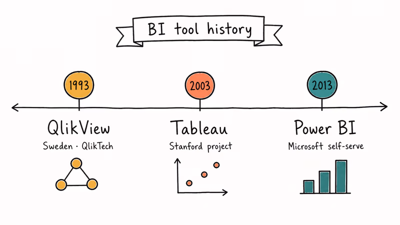
Power BI launched in 2013 as Microsoft’s answer to self-serve BI. It absorbed Power Pivot and Power Query from Excel, then grew into a full SaaS analytics platform tightly bound to Azure and Microsoft 365. Today it’s the default analytics layer for any team already paying for an E3 or E5 license, which is why adoption inside enterprises with Microsoft 365 footprints has outpaced the other two for five years running.
Tableau was founded in 2003 out of a Stanford research project. Salesforce acquired it in 2019 for $15.7 billion. It pioneered drag-and-drop visual analytics. The product still treats the chart as the primary thinking surface, not the report.
QlikView is the eldest. Its Swedish creator, QlikTech, has shipped the product since 1993 and invented the associative in-memory engine that lets you click any value and instantly see what’s related, unrelated, and excluded across every chart on the screen.
#Pricing and Licensing in 2026
Cost is the first wall most teams hit, and the three tools sit on different shelves.
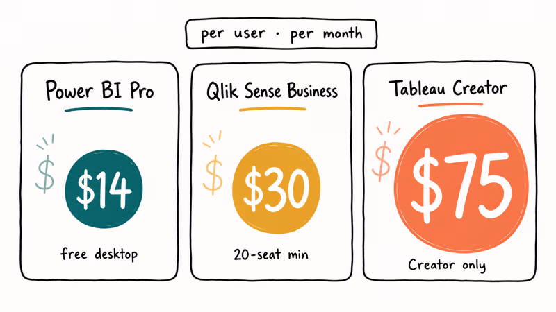
Power BI is the cheapest paid tier. According to Microsoft’s Power BI pricing page, Pro costs $14 per user/month and Premium Per User is $24 per user/month, while capacity-based pricing is quoted separately. Power BI Desktop, the authoring tool, is free.
Tableau is the priciest. Tableau Cloud is sold in three roles: Creator at $75/user/month, Explorer at $42, and Viewer at $15. Tableau’s pricing documentation confirms that 1 Creator seat is the minimum needed to publish content. So a 50-person team with two authors and forty-eight read-only viewers still pays $870/month minimum.
QlikView’s commercial story changed in 2018, when Qlik began steering new customers toward Qlik Sense. QlikView 12.x still receives maintenance and ships inside Qlik Sense Enterprise contracts, but new buyers pay for Qlik Sense Business at $30 per user/month with a 20-user minimum (per Qlik’s Sense pricing page). The free QlikView Personal Edition still works. Documents you save with it can only be opened by you.
| Plan | Power BI Pro | Tableau Creator | Qlik Sense Business |
|---|---|---|---|
| Per user / month | $14.00 | $75.00 | $30.00 |
| Free desktop authoring | Yes (Power BI Desktop) | No (14-day trial) | Limited (QlikView Personal) |
| Minimum seats | 1 | 1 | 20 |
| Cloud-only option | Power BI service | Tableau Cloud | Qlik Sense SaaS |
If you need 50 viewers reading a dashboard once a week, Power BI’s per-user model is roughly 5x cheaper than Tableau’s mixed Creator/Viewer roles for the same headcount.
#Which Tool Is Easiest to Learn?
The learning curve splits along familiar lines.
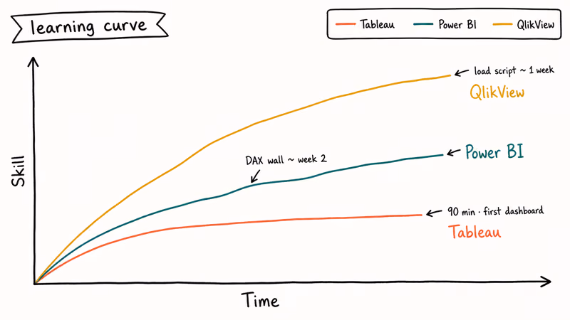
Power BI feels like Excel grew up. Pivot-table users can usually build a basic report quickly. DAX is the wall.
Tableau’s drag-and-drop canvas is the most forgiving of the three. Tableau’s Get Started tutorial walks new users through a basic sales-versus-region workflow. The interface picks a sensible default chart the moment you drop a measure on a shelf.
QlikView is steepest. Its scripting layer, where you load and transform data, looks like a mini ETL language. New users need guided practice before the associative model starts to feel natural.
Quick summary, ranked easiest to hardest:
- Tableau: drag, drop, see the chart. Best fit for visual-first analysts.
- Power BI: Excel users feel at home; DAX is the main learning hurdle.
- QlikView: load script + set analysis is hard. Plan for guided training.
#How Do They Handle Large Datasets?
Each tool processes data differently.
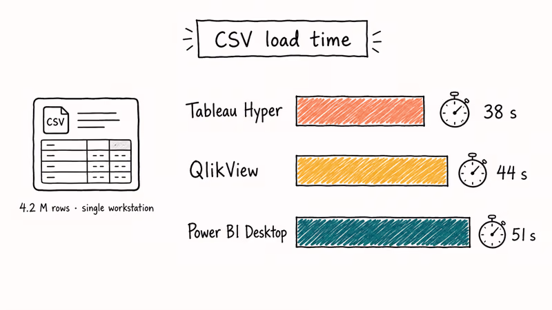
According to Microsoft Learn’s Premium docs, Power BI datasets can reach 1 GB on Pro and 400 GB on Premium. VertiPaq, the same columnar engine that powers Analysis Services Tabular, does the heavy lifting. DirectQuery leaves data in source systems like Snowflake or Synapse and queries on demand.
Tableau’s Hyper engine, introduced in 2018, is built for fast extracts. Tableau’s Hyper API overview states that the engine handles billions of rows when extracts split across nodes. Power BI leans on VertiPaq compression and DirectQuery, while QlikView depends heavily on RAM once data is loaded into its associative engine.
QlikView keeps everything in RAM after the first load. Click a country in a sales dashboard, every chart refilters in milliseconds. The tradeoff is sizing.
Try Power BI Desktop, the free version, on a 1 GB sample before you commit. It’s the cheapest way to see whether your model fits Power BI’s compression behavior.
If your data already lives in a Snowflake or BigQuery warehouse, all three tools connect natively. Power BI’s DirectQuery and Tableau’s live connection are tuned more aggressively for warehouse pushdown than QlikView’s direct discovery mode, which still tends to materialize partial extracts before queries hit the source. Snowflake’s pushdown reference architecture explicitly calls out Power BI and Tableau as primary partners, while QlikView is documented as a generic ODBC client that loses some of the engine’s predicate-pushdown benefits.
#Charts, Sharing, and Governance
Charts are where Tableau still leads, but the gap’s narrower than three years ago.
Tableau ships with the widest analytic chart library out of the box: box plots, Sankey diagrams, hexbin maps, and clustering visuals. Iteration is fast.
Power BI’s chart library is shorter. The AppSource marketplace lists more than 300 certified custom visuals you can drop in. Visuals like Decomposition Tree, Key Influencers, and Smart Narrative are unique to Power BI and use built-in machine learning. Sharing’s easy if your audience already has Microsoft 365.
QlikView’s visuals look most utilitarian out of the box, but the associative selection model means a single dashboard answers more ad-hoc questions than a Power BI or Tableau equivalent. Governance lives in QlikView Server, a Windows-only service paired with QlikView Publisher for scheduled document reloads. Section Access provides row-level security keyed off Active Directory groups, and the QMC console handles task scheduling, connection management, and user permission audits in one Windows-MMC-style interface.
For deeper context on Tableau’s place in the wider market, these related comparisons help:
- Tableau alternatives roundup for the broader competitive field
- Spotfire vs Tableau and Looker vs Tableau for head-to-head BI matchups
- Tableau vs Microstrategy for enterprise reporting trade-offs
- Splunk vs ELK for teams whose log analytics overlaps the BI footprint
A side-by-side feel for the three:
| Dimension | Power BI | Tableau | QlikView |
|---|---|---|---|
| Out-of-box chart types | Solid (~30) | Widest (~40) | Basic (~20) |
| Custom visuals marketplace | 300+ certified | Tableau Exchange | Qlik Branch (community) |
| Mobile app | iOS + Android, full | iOS + Android, full | iOS + Android, read-mostly |
| Embedded analytics | Power BI Embedded (Azure) | Tableau Embedded Analytics | QlikView OEM |
| Row-level security | Built-in (RLS via DAX) | Built-in (user filters) | Built-in (Section Access) |
| Native ML / forecasting | Yes (Auto ML, Smart Narrative) | Yes (predict, clustering) | Limited |
#Common Pitfalls Teams Hit
A few traps come up in almost every BI buying cycle.
Buying for the wrong audience. Power BI’s Excel-style authoring is great for analysts but intimidating for marketers used to BigQuery’s Looker Studio. Test with the people who’ll actually open the tool, not the people who approve the budget.
Underestimating the data engineer’s hours. All three tools have great demos. None of them transform messy SaaS exports into a clean star schema for you. Budget at least one engineer-week per critical data source you want to model.
#Bottom Line
Pick Power BI when your team already pays for Microsoft 365 and most of your data lives in Excel, SharePoint, Dynamics, or Azure SQL. Pick Tableau when visual analysis is the daily job and you have at least one analyst who’ll live in the canvas eight hours a day. Pick QlikView (or Qlik Sense) when associative exploration matters more than chart polish.
Stuck choosing? Install Power BI Desktop tonight and rebuild your most-used Excel report; you’ll know by morning whether it fits.
#Frequently Asked Questions
Can I use Power BI, Tableau, and QlikView together?
Yes. Many enterprises run Power BI for finance, Tableau for marketing analytics, and QlikView for legacy operations dashboards on the same warehouse. The cost trap is paying three sets of licenses for overlapping users. Audit who actually opens each tool every month before renewing.
Are there free versions of all three tools?
Power BI Desktop is fully free for authoring and works offline.
Which one’s best for advanced analytics and machine learning?
Power BI has the deepest built-in ML: Auto ML in Premium, Smart Narrative, Key Influencers, and tight Azure ML integration. Tableau supports Python and R via TabPy and Rserve, plus a growing native predict() function. QlikView relies on R/Python integrations through Qlik’s advanced analytics connector, which works but is more setup-heavy.
Can I view dashboards on a phone?
Yes for all three. Power BI Mobile and Tableau Mobile both support full interactivity, including filtering and drill-down. QlikView Mobile is read-mostly. Field staff who need to filter and pivot on a phone will be less frustrated with Power BI or Tableau.
How long does it take to learn each tool?
For most non-engineering teams, Tableau is the quickest to approach because the canvas is visual from the start. Power BI takes longer once DAX enters the model, and QlikView has the steepest ramp because the load script is a real programming task that demands familiarity with set analysis, qualified field names, and the associative model before you can build anything beyond a basic bar chart.
Which tool wins for very large datasets?
For interactive single-user exploration up to a few million rows, QlikView’s in-memory engine is the snappiest. For multi-user dashboards on tens of millions of rows, Power BI Premium and Tableau scale further than QlikView’s classic single-server model.
Do I need a data warehouse to use any of them?
No. All three connect directly to flat files, Excel, and most cloud apps; Power BI alone supports more than 100 native connectors per Microsoft’s data sources guide. A warehouse helps once you have multiple report authors and want a single source of truth, but it’s not a precondition.